Understanding Content Blocks
How the LXGlobal website pages are built from reusable content blocks.
Every page on the LXGlobal website is built from content blocks — reusable sections that you can mix and match to create different page layouts.
What Are Content Blocks?
Section titled “What Are Content Blocks?”Think of content blocks like building blocks. Each block is a section of the page with a specific purpose:
| Block | What It Shows | Used For |
|---|---|---|
| Hero Banner | Full-width banner with background image and heading | Top of every page |
| Text Block | Heading with body text | Introduction text, descriptions |
| Media Block | Text alongside an image (two columns) | Detailed content with visuals |
| Media Block Group | Grid of image cards | Listing sub-pages or categories |
| Service Cards Grid | Grid of service/sector cards | Showing related services |
| Resources Banner | Call-to-action banner with button | Encouraging contact or next steps |
| Governance Cards | Simple navigation card tiles | Quick links to related pages |
| Profiles List | Team member profiles with photos and bios | Leadership pages |
| Contact Form | A contact form with image | Contact page |
| Carousel | Rotating image gallery | Showcasing multiple images |
How Pages Are Structured
Section titled “How Pages Are Structured”Almost every page on the site follows this pattern:
- Hero Banner — eye-catching header
- Content section — Text Block, Media Block, or similar
- Cards/Grid section — Service Cards, Media Block Group, etc.
- Resources Banner — call-to-action at the bottom
Viewing Content Blocks
Section titled “Viewing Content Blocks”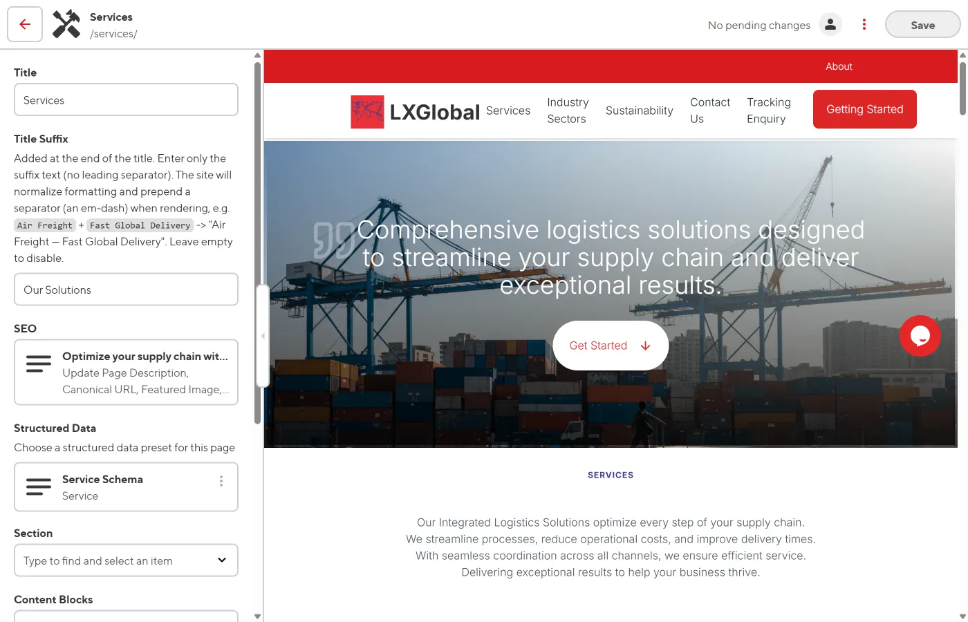
When you open a page in the Visual Editor:
- Each content block appears as a distinct section on the page
- Click on a block to select it — the sidebar shows its fields
- The sidebar lists all blocks under the Content Blocks list